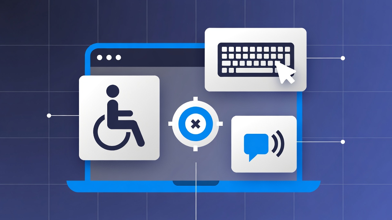
Accessibility is not a feature for a small percentage of users. It is a fundamental quality of web experiences. At least 15% of people have disabilities affecting how they interact with technology. Accessibility improvements benefit everyone: captions help in noisy environments, keyboard navigation helps power users, clear structure helps mobile users, good contrast helps in bright sunlight.
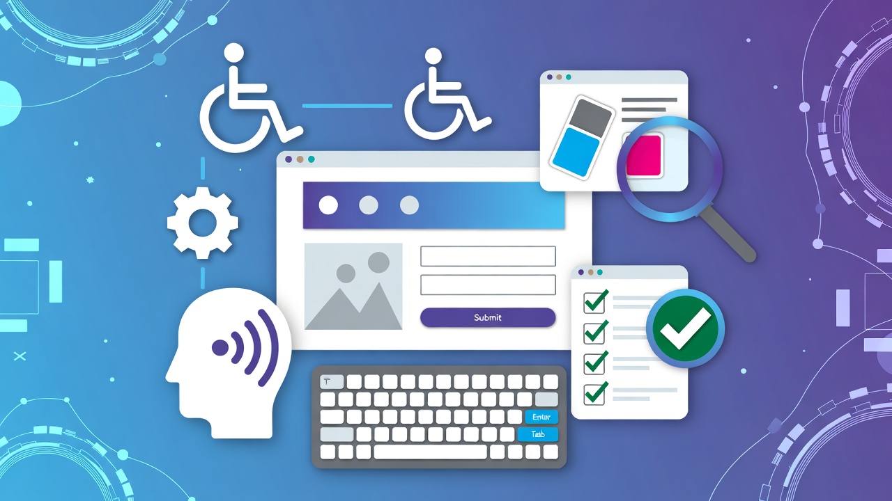
Building accessible applications requires understanding how assistive technologies work, following established guidelines, and testing with the tools disabled users rely on. It is not just about screen readers; it is about color contrast, keyboard navigation, cognitive load, and flexible interfaces that adapt to user needs.
This guide covers the patterns that work: understanding WCAG guidelines and compliance levels, semantic HTML as the foundation, ARIA patterns for complex components, keyboard navigation implementation, testing with assistive technologies, and building inclusive design systems.
Understanding Disability and Accessibility
Types of Disabilities
Visual: Blindness, low vision, color blindness Auditory: Deafness, hearing impairment Motor: Limited dexterity, inability to use mouse Cognitive: Learning disabilities, attention deficits, memory issues
Assistive Technologies
Screen readers: NVDA, JAWS, VoiceOver Screen magnifiers: ZoomText Switch controls: Single-button navigation Voice control: Dragon NaturallySpeaking
WCAG 2.1 Guidelines
The Four Principles (POUR)
Perceivable: Information must be presentable in ways users can perceive Operable: Interface components must be operable by all users Understandable: Information and UI operation must be understandable Reliable: Content must work with current and future assistive technologies
Compliance Levels
Level A: Minimum accessibility (must have) Level AA: Strong accessibility (should have) - Legal requirement in many jurisdictions. For a step-by-step auditing process, read our website ADA and WCAG compliance guide. Level AAA: Excellent accessibility (ideal to have)
Key Requirements
Perceivable:
- Text alternatives for images
- Captions/transcripts for multimedia
- Minimum 4.5:1 contrast ratio (AA)
- Resizable text up to 200%
Operable:
- All functionality available by keyboard
- No keyboard traps
- Sufficient time to complete tasks
- No seizure-inducing content
Understandable:
- Readable text (simplified language for AAA)
- Consistent navigation
- Error prevention and recovery
- Input assistance
Reliable:
- Valid HTML
- Compatible with assistive technologies
- Status messages announced
Semantic HTML
The Foundation
Semantic HTML provides accessibility for free. Use it before adding ARIA.
<!-- Bad: Generic divs -->
<div class="header">...</div>
<div class="nav">...</div>
<div class="main">
  <div class="article">
    <div class="h1">Title</div>
  </div>
</div>

<!-- Good: Semantic elements -->
<header>...</header>
<nav>...</nav>
<main>
  <article>
    <h1>Title</h1>
  </article>
</main>
Headings
<!-- Proper heading hierarchy -->
<h1>Page Title</h1>
  <h2>Section 1</h2>
    <h3>Subsection 1.1</h3>
  <h2>Section 2</h2>
    <h3>Subsection 2.1</h3>
    <h3>Subsection 2.2</h3>
Forms
<form>
  <!-- Associated label -->
  <label for="email">Email Address</label>
  <input
    type="email"
    id="email"
    name="email"
    required
    aria-required="true"
    aria-describedby="email-error"
  >
  <span id="email-error" role="alert" class="error"></span>

  <!-- Fieldset for groups -->
  <fieldset>
    <legend>Preferred Contact Method</legend>

    <input type="radio" id="contact-email" name="contact" value="email">
    <label for="contact-email">Email</label>

    <input type="radio" id="contact-phone" name="contact" value="phone">
    <label for="contact-phone">Phone</label>
  </fieldset>
</form>
Landmarks
<header role="banner">
  <nav role="navigation" aria-label="Main">
    <!-- Navigation links -->
  </nav>
</header>

<main role="main">
  <article>
    <h1>Article Title</h1>
  </article>
</main>

<aside role="complementary" aria-label="Related articles">
  <!-- Related content -->
</aside>

<footer role="contentinfo">
  <!-- Copyright, links -->
</footer>
ARIA Patterns
When to Use ARIA
Use when:
- Creating custom components (tabs, modals, accordions)
- Providing additional context
- Dynamic content updates
Do not use when:
- Native HTML element exists
- Semantic HTML suffices
- Adding ARIA to hide semantics
Common Patterns
Button:
<!-- Custom button -->
<div role="button"
     tabindex="0"
     aria-pressed="false"
     onclick="handleClick()"
     onkeydown="handleKeydown(event)">
  Click me
</div>
Modal Dialog:
<div role="dialog"
     aria-modal="true"
     aria-labelledby="dialog-title"
     aria-describedby="dialog-description">
  <h2 id="dialog-title">Confirm Delete</h2>
  <p id="dialog-description">
    This will permanently delete the item.
  </p>
  <button>Cancel</button>
  <button>Delete</button>
</div>
Tabs:
<div class="tabs">
  <div role="tablist" aria-label="Product Sections">
    <button role="tab"
            aria-selected="true"
            aria-controls="panel-1"
            id="tab-1">
      Description
    </button>
    <button role="tab"
            aria-selected="false"
            aria-controls="panel-2"
            id="tab-2"
            tabindex="-1">
      Specifications
    </button>
  </div>

  <div role="tabpanel" id="panel-1" aria-labelledby="tab-1">
    <!-- Description content -->
  </div>
  <div role="tabpanel" id="panel-2" aria-labelledby="tab-2" hidden>
    <!-- Specifications content -->
  </div>
</div>
Live Regions:
<!-- Status announcements -->
<div id="status" role="status" aria-live="polite" aria-atomic="true">
  <!-- Content changes announced to screen readers -->
</div>

<!-- Alert announcements -->
<div id="alert" role="alert" aria-live="assertive">
  <!-- Urgent messages -->
</div>
Keyboard Navigation
Focus Management
// Visible focus indicator
:focus {
  outline: 2px solid #005fcc;
  outline-offset: 2px;
}

// Focus trap for modals
class Modal {
  open() {
    this.previousFocus = document.activeElement;
    this.modal.showModal();

    // Trap focus
    this.modal.addEventListener('keydown', (e) => {
      if (e.key === 'Tab') {
        this.trapFocus(e);
      }
    });

    // Focus first element
    this.focusableElements[0]?.focus();
  }

  close() {
    this.modal.close();
    // Restore focus
    this.previousFocus?.focus();
  }

  trapFocus(event) {
    const focusable = this.focusableElements;
    const first = focusable[0];
    const last = focusable[focusable.length - 1];

    if (event.shiftKey && document.activeElement === first) {
      event.preventDefault();
      last.focus();
    } else if (!event.shiftKey && document.activeElement === last) {
      event.preventDefault();
      first.focus();
    }
  }
}
Keyboard Shortcuts
// Accessible keyboard handling
document.addEventListener('keydown', (e) => {
  // Skip link
  if (e.key === 'Tab' && e.target === document.body) {
    document.getElementById('skip-link').focus();
  }

  // Escape to close modals
  if (e.key === 'Escape') {
    closeOpenModals();
  }

  // Arrow keys for custom components
  if (['ArrowUp', 'ArrowDown', 'ArrowLeft', 'ArrowRight'].includes(e.key)) {
    if (isInListbox(e.target)) {
      navigateListbox(e);
    }
  }
});
Testing Accessibility
Automated Testing
Automated tools are an excellent starting point for scanning your site for common accessibility violations. For websites running on WordPress, you can use dedicated plugins to automate and monitor these checks; see our guide to the best WordPress plugins for ADA and WCAG compliance to choose the right solution.
For developers and custom builds, CLI and testing libraries offer programmatic validation:
# axe-core CLI
axe https://example.com --tags wcag2aa

# Pa11y
pa11y https://example.com --standard WCAG2AA

# Lighthouse
lighthouse https://example.com --only-categories=accessibility

# Jest + jest-axe
npm install --save-dev jest-axe
// jest-axe example
import { render } from '@testing-library/react';
import { axe, toHaveNoViolations } from 'jest-axe';
import Button from './Button';
expect.extend(toHaveNoViolations);
test('Button has no accessibility violations', async () => {
const { container } = render(<Button>Click me</Button>);
const results = await axe(container);
expect(results).toHaveNoViolations();
});Manual Testing
Keyboard-only navigation:
- Unplug mouse
- Move through entire page with Tab, Shift+Tab, Enter, Space, Arrow keys
- Verify all functionality works
- Check focus visibility
Screen reader testing:
NVDA (Windows, free):
- Install NVDA
- Navigate with Insert + Arrow keys
- Read element: Insert + Tab

VoiceOver (macOS, built-in):
- Enable: Cmd + F5
- Navigate: Cmd + Option + Arrow keys
- Read element: Ctrl + Option + Cmd + T
Color and Contrast
# WAVE browser extension
# Check contrast errors

# axe DevTools
# Shows contrast ratios
Manual check:
- Screenshot in grayscale
- Verify all information is still conveyed
- Check that color is not the only indicator
Inclusive Design
Cognitive Accessibility
/* Readable text */
body {
  font-family: system-ui, sans-serif;
  font-size: 16px;
  line-height: 1.5;
  max-width: 70ch;
}

/* Clear focus */
:focus {
  outline: 3px solid;
  outline-offset: 3px;
}

/* Reduce motion */
@media (prefers-reduced-motion: reduce) {
  *, *::before, *::after {
    animation-duration: 0.01ms !important;
    animation-iteration-count: 1 !important;
    transition-duration: 0.01ms !important;
  }
}
Responsive and Flexible
/* Text resizing support */
html {
  font-size: 100%; /* Respect user preference */
}

/* Container queries for flexibility */
.card {
  container-type: inline-size;
}

@container (min-width: 400px) {
  .card-content {
    display: grid;
    grid-template-columns: 1fr 2fr;
  }
}

/* Touch target sizing */
button, .button {
  min-height: 44px;
  min-width: 44px;
  padding: 12px 16px;
}
Testing Checklist
## Accessibility Checklist

### Visual
- [ ] Color contrast 4.5:1 for text (AA)
- [ ] Information not conveyed by color alone
- [ ] Text resizes to 200% without loss
- [ ] Focus indicators visible

### Motor
- [ ] All functionality keyboard accessible
- [ ] No keyboard traps
- [ ] Skip links provided
- [ ] Sufficient time for interactions

### Cognitive
- [ ] Clear, consistent navigation
- [ ] Error prevention and recovery
- [ ] Readable text (simplified for AAA)
- [ ] No auto-playing content

### Assistive Technology
- [ ] Screen reader compatible
- [ ] ARIA used correctly
- [ ] Status messages announced
- [ ] Form labels associated
Building an Accessibility Culture
Accessibility is not a one-time audit. It is an ongoing practice that requires buy-in from the entire organization. Developers need to write semantic HTML. Designers need to consider color contrast and keyboard flows. Content creators need to write descriptive alt text and clear headings. Project managers need to allocate time for accessibility testing.
Start with automated tools to catch the easy issues. Progress to manual testing with keyboards and screen readers. Involve users with disabilities in usability testing. Document your accessibility practices and train new team members. Over time, accessibility becomes part of how the team builds products, not a checkbox at the end of a project.
For organizations looking to accelerate their accessibility efforts, Veduis offers compliance solutions including professional audits, remediation services, and ongoing monitoring to keep your site accessible and compliant.